Ternary graphs are a type of two-dimensional graphs with three axes. The axes are not perpendicular, but at 60° from each-other, like an equilateral triangle. Because of this, the variables the three axes represent necessarily cannot be independent. Instead of representing arbitrary relationships between two variables like a typical graph ternary graphs represent three variables which always sum to a constant.
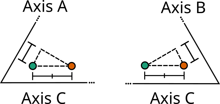
For some visual intuition of how this works, see below where we move a point along axis C two units. Since axes A and B aren't perpendicular to C, this means that the point moves some along them as well.
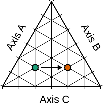
In axes A and B the point moves one unit each, countering the amount added by axis C1. Whatever value the three variables added up to at the first point, they will add up to at the second point. And this is true no matter what direction you move in.
Ternary graphs are usually used to see how three components of a mixture add up to 100% like in this soil type chart:
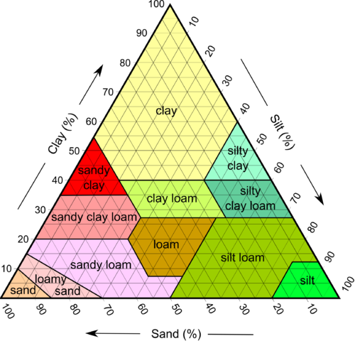
One thing to note is that in these graphs, the three axes are oriented at 60° from the graph edges. You can see this by how they orient the percentage labels. This is done because when one component is 0%, you still need to represent the entire range of mixtures of the other two. To fit this in a graph where the axes are perpendicular with the graph edges (like we're used to with two axis graphs) you end up with a lot of wasted space:
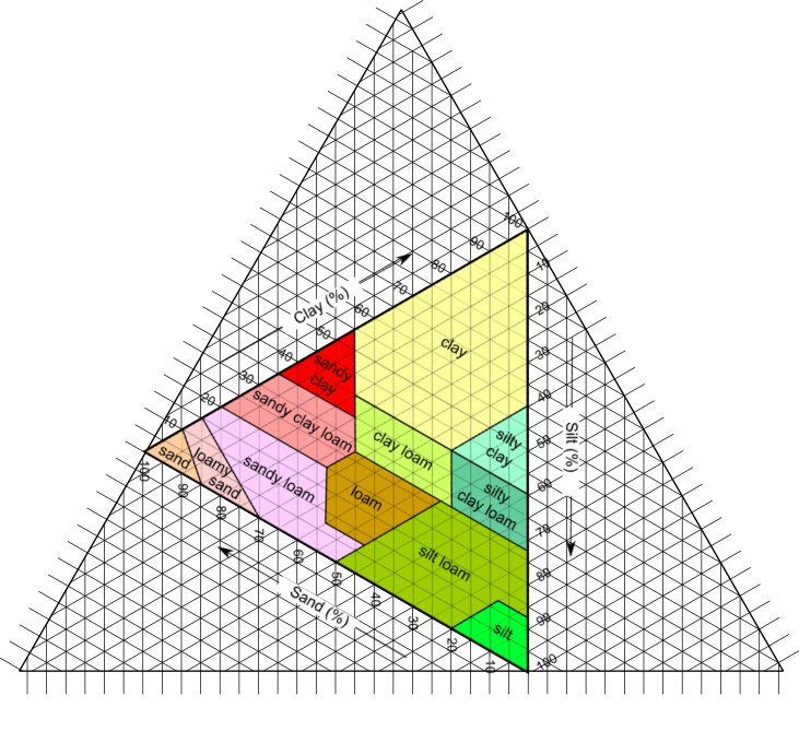
So to avoid this, these graphs are presented with the unusable space chopped off and the whole thing rotated to a more natural orientation. This is worth doing if you're making these composition graphs, but otherwise I believe it is more readable to keep the graph axes parallel to the edges of the graph like normal graphs.
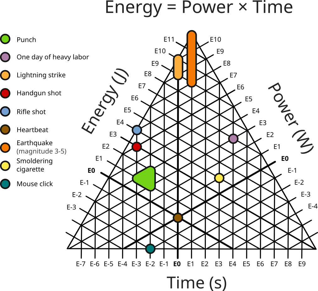
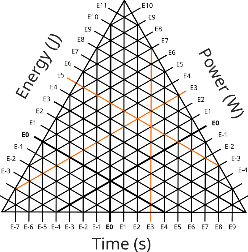
So ternary graphs are neat as a concept, but I'm specifically interested in using them to illustrate order-of-magnitude relationships. They are particularly suited to this because they can represent linear relationships of three variables (i.e. \(a = b \times c\)). This works because when you take the logarithm of the equation, it becomes additive: \(log(a) = log(b) + log(c)\). This means we can take any linear relationship and plot it out on an order-of-magnitude ternary graph which is whats going on in the first graph of the post where we see the listed 'energy events' plotted out.
Plotting these relationships out can help illuminate the patterns that emerge when considering things from an order-of-magnitude perspective. For example, if we graph out the relationship between mass, volume, and density for major solar system objects, we get this:
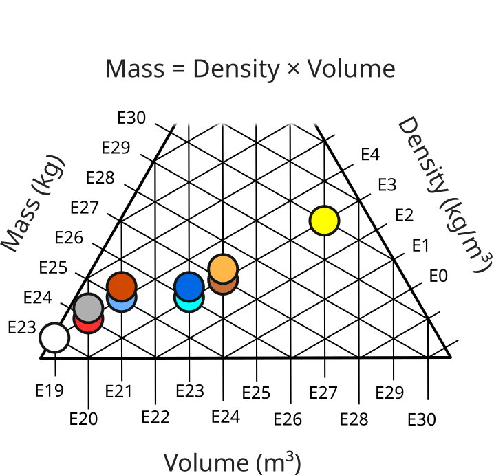
Here we see that even though the volume and mass varies greatly, there are just two rough categories of density. But even if there is no visual pattern that needs deciphering, having the data layed out is a good way to quickly reference order-of-magnitude values.
The relationships don't even strictly need to be linear. For example, as an experiment I graphed out the stellar intensity vs. temperature and radius for a number of stars which is \(L = 4 \pi R^2 \sigma T^4\)3.
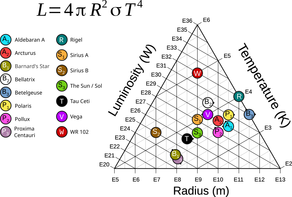
Notice how for example if we increase radius by a factor of ten while keeping temperature constant, then Luminosity increases by a factor of 100 (i.e. we move one full tick on the radius axis without moving on the temperature axis, then we move two ticks on the luminosity axis).
This does introduce some issues which I have not found a satisfactory solution for yet. For example, look at Pollux on the graph. Notice how it sits on the tick marks for E28 W Luminosity and E10 m Radius, but in between E3 and E4 K Temperature whereas its actual temperature is best represented by E4 K. If we were to move it to any other position it would not be clear what its luminosity and radius are since it's already at the intersection of those two ticks. To indicate that it's actually E4 K, I added a little arrow to it pointing in that direction along the temperature axis. This is serviceable, but not particularly clear. As of yet I have not been able to come up with anything I feel is better suited.
Honestly I think that, as a visualization tool, ternary graphs of order-of-magnitude relationships are more of a curiosity and experiment for me right now. It's fascinating that these relationships can be represented this way, and the visual stimulation of the graphs is valuable to draw someone in and make them think about the relationship being represented. However, as far as whether the technique is generally effective or efficient I think is still an open question.
Addendum: Representing Mismatched Estimations
Every order-of-magnitude value is an approximation, for example E3 is an approximation of 450. However, when you have approximations of three different numbers in a relationship like one of the above, the sum of the approximations might not match the approximation of the sum. Suppose we have an energy event we want to plot on the graph above where the event's time is 390 s, it's power is 501 W and so the total energy of the event is 195,390 J. However, taking the order-of-magnitude of these values we get E3 s, E3 W, but E5 J. Of course \(3 + 3 \ne 6\) which is a natural hazard of these kinds of approximations, but that leaves us with a dilema of how to represent this on the graph. There is no intersection of these three values at a single point.
To deal with this, ideally we'd be able to represent 1. the exact values of the data point 2. the fact that those values don't match up. I have not found a single satisfactory solution, but here are some possibilities:
1: Use a triangle. By placing a triangle between tick marks, the edges can line up with the data point's tick marks and the different shape indicates that this data point is unusual.
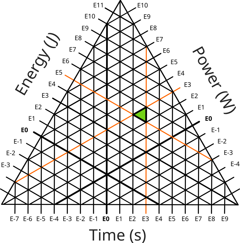
This is clever, but is just not visually intuitive. If you included this in a graph, you would probably need something to explain it (although ternary graphs are unusual enough you would probably need that anyway).
2: Use a (slightly different) triangle. By using a triangle with rounded corners with the same radius as the other data points, this should hopefully indicate that the value could be any one of the values covered by it.
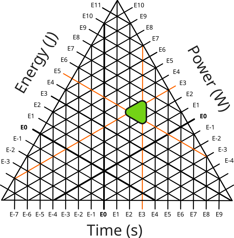
While this (hopefully) deals with the visual ambiguity, it introduces some data ambiguity. First, it's not clear which of the values is indicated by it. Second, it's not clear that this data point is mismatched. For example you could use the same technique to indicate a case where the value may vary which is what I did in the graph at the top. This is used to represent the range of values I found while getting data on punch energy genuinely do range over the values that the spread data point covers4. In this case I did not use this technique to indicate that there was a mismatch but if I did make a habit of that it might be less clear what I was trying to convey here.
3: Punt. This is the technique I have used so far. If you have a choice of what data points to include in the graph, and you don't need to include a mismatch point, then you can just not include it.
- Depending which direction the axes are oriented ↩︎
- https://creativecommons.org/licenses/by-sa/4.0/deed.en Author: cmglee, Mikenorton, United States Department of Agriculture ↩︎
- Where \(\sigma\) is the Stefan-Boltzmann constant ↩︎
- Not that the values range over an order-of-magnitude, but that they span the break-point between two orders-of-magnitude ↩︎